
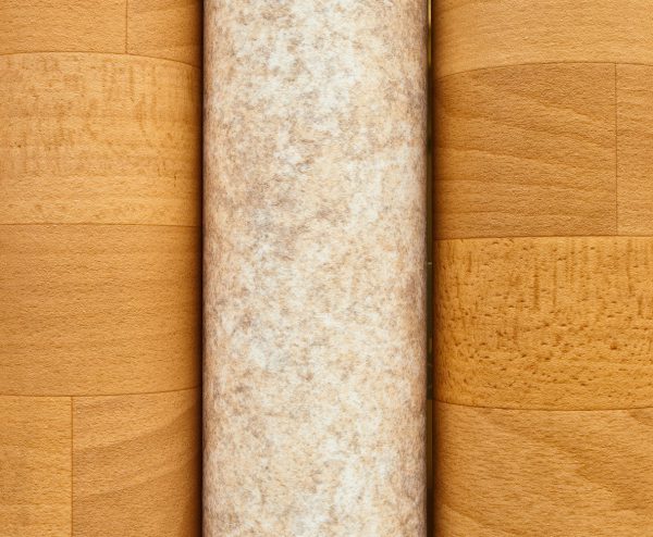
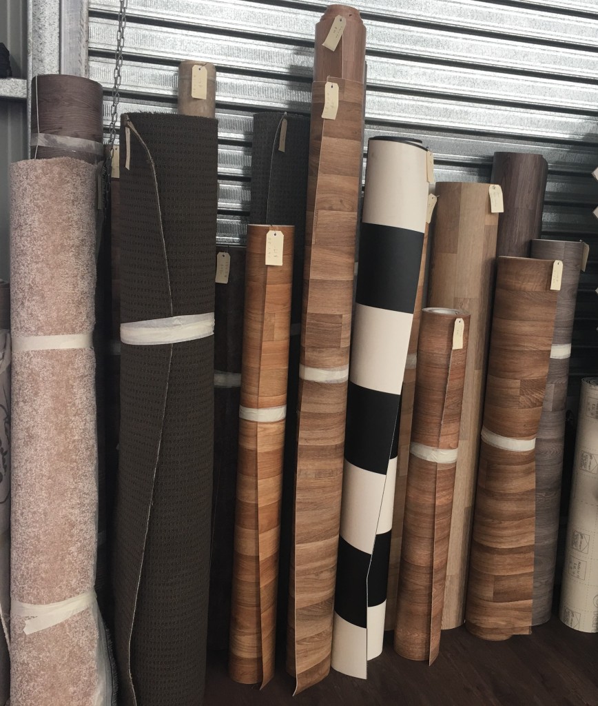
Vinyl Planks
Dreaming of hardwood floors, but put off by the price and upkeep? Vinyl planks may be the answer.
Dreaming of hardwood floors, but put off by the price and upkeep? Vinyl planks may be the answer.

We supply ceramic tiles for all aspects of your home including interior and exterior!
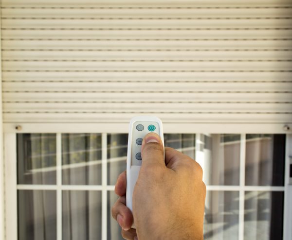
Whether you’re looking for privacy screening or a complete blockout, we’ve got the perfect product to suit your needs.
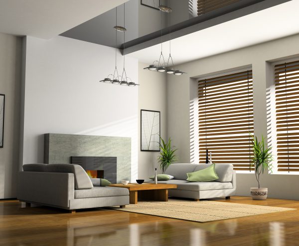
Protect your home from sun with exterior blinds on windows and around patios.

Could floating laminate flooring be suitable for your home?

Add a lasting touch of class to your home with our stylish range of plantation shutters.

If you’ve got a commercial space that needs re-flooring, we’ve got the solution!

Our knowledgeable team can provide advice on the right floorcoverings and window furnishings for your home or commercial premises, including installation, for clients in Warwick Qld and all surrounding areas.
We not only provide the flooring, we can also arrange to do the installation. With Ken O’Dea Floorcoverings, you can trust that your new floorcovering is being installed by trained professionals.
Give yourself the peace of mind that comes with knowing the job has been done right – call us today on (07) 4667 1471.
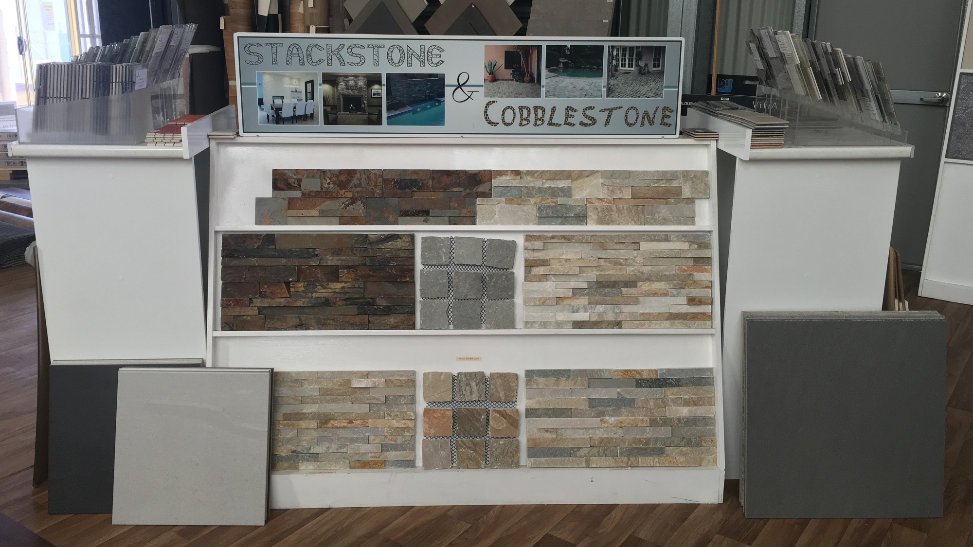
There are many reasons you might choose Ken O’Dea Floorcoverings. We supply a range of quality products that are hard to beat. Whether you’re looking for vinyl planks, ceramic floor tiles, laminate flooring or carpet, if you’re looking for floorcoverings in the Warwick Qld area, Ken O’Dea has you covered.
Ken O’Dea Floorcoverings also offers an extensive range of window furnishings. Our products include interior blinds, exterior blinds, and high quality wood or PVC plantation shutters, perfect for adding a luxurious aesthetic to any home.
To view our products, simply take a look at our Gallery – or for a more hands-on experience, visit our showroom at 16 Betta Place, Warwick, QLD 4370.


Our stunning showroom has a huge range of floor coverings and window furnishings to suit every aesthetic. Come and see for yourself! Visit our showroom for an obligation free discussion and colour consultation.
Our Showroom is open Monday to Friday from 9:00 am to 5:00 pm and Saturdays from 9:00 am to 11 am. If you need to meet outside these times, give us a call and schedule an appointment.